Thursday, April 11, 2019

Video Project Reflective Blog


Video Assignment Reflective Blog

I decided to create a video that highlighted unique individuals at the University of Mount Union and how they are making the most of their opportunities on campus. The entire production process was rigorous, yet enjoyable. Upon completion, I was truly proud of the product I created. 


This assignment showed me many elements that I liked about video production. In fact, this assignment at first was incredibly intimidating, but after some trial and error I began to enjoy the editing software and the tools I could use to make my videos more professional. Initially, I created a storyboard. A storyboard is essentially a way to outline the shots and sequence of a video. This helped me organize how many actors I would need, where I could utilize cuts and still shots, and what backgrounds I would use in my shots. I also enjoyed working with the different kinds of cuts the editing software had to offer. I successful used a cross dissolve and a simple cut in my video. There is an example of a cross dissolve at 0:04 and an example of a simple cut at 0:37. I tried to create a jump cut at the last transition of actors at 1:19 but failed. If I ever create another video, I want to make sure that I understand the jump cut because I think it can be useful tool. Lastly, I tried to incorporate many of the rules discussed in class such as rule of thirds, head space, and looking room. I kept all of these in mind when shooting the scenes. My idea for this video was to create a smooth commercial highlighting different friends of mine. Using video as a medium afforded me the ability to create cuts to seamlessly show different scenes with different people. I feel like an idea like this would be more difficult to execute using audio or writing as a medium. 

While I thoroughly enjoyed the bulk of this assignment, it certainly came with a number of challenges. The main struggle I had, and this may seem weird, was learning to use a Mac. I had never used a Mac before, and I was borrowing one to use Imovie as my video editing software. It took me an hour or so of use to get a feel for how to navigate it and use the Imovie software. It led to some early frustration but I quickly got used to it and after a few days, using the Mac was no longer a problem. 

Another difficulty I experienced was attempting an L cut. I wanted to do an L cut at 1:07 when the scene shifted to the athletic complex. There were background sounds of basketballs and I thought I would be able to fade that sound in before that scene started. When I was trying to mess with the audio, everything was off and I just couldn't grasp the idea. I'm glad that I tried at all, but disappointed I couldn't make it work. These challenges taught me that video editing can be intimidating/challenging at times, but with a little bit of dedication along with ample internet resources to help, it is a really a great medium that is relatively simple to get comfortable with. I'm proud that I as able to incorporate many of the elements we discussed in class into my video, and I truly think they led to a semi-quality video.

In summary, I gained a vast amount of knowledge and experience from this assignment. I now know what makes a shot look good, how to transition from scene to scene, and how to use many tools in an editing software. In today's media driven world, video is at the forefront of it all. Videos are an excellent way to give a pictorial and auditory representation of an idea. With this acquired knowledge, I feel like I will be able to assign video assignments in my future classroom. I will know how to help students use the software and create the video. I can also help them format it and upload to the internet. Sometimes, the best way to show information is through a video and I am grateful I was afforded the opportunity to gain some experience with it. I still do not know what I want to do for the final project in this class, but video is definitely not ruled out. I really did enjoy this assignment and if I think of a good enough idea, I may use video as my medium. 
Thursday, February 28, 2019

Universal Design

Universal Design

Universal design is a relatively new idea that came about midway through the 20th century. The National Disability Authority defines universal design as, "The design and composition of an environment so that it can be accessed, understood and used to the greatest extent possible by all people regardless of their age, size, ability or disability"(n.d). Basically, universal design is designing something to meet the needs of all people. This blog post will investigate the history of universal design, evaluate cases of universal design principles in biology, and provide a brief overview of usability testing as a test of universal design.

History of Universal Design

Up until the 1970s when the disability rights movement happened, individuals who were elderly or had a disability were largely forgotten about. When I say forgotten about,  there really weren't any laws requiring manufacturers to design products to be accessible for all. They were simply worried about making things accessible to the majority. However, the efforts of disabled military veterans as well as a number of other committees led to the first accessibility standard, "117.1-  Making Buildings Accessible to and Usable by the Physically Handicapped" (Center for Universal Design). This standard, passed in 1961, was monumental to the progression of disability rights and the progression of universal design. By 1973, 49 states had passed some kind of accessibility legislation.

In addition to legislation making buildings and products accessible to all people, there was also legislation preventing the discrimination against disabled people. The Americans with Disabilities Act of 1990 protected disabled people from discrimination in employment, services, programs, public transportation, etc. These efforts over roughly three decades were instrumental in establishing a culture of tolerance, equity, and acceptance. Then with the development of the internet, it was apparent this newly established culture carried over rather easily. There was a learning curve to this brand new revolutionary medium, but over time, the internet has become one of the best hubs for accessibility resources. There are countless examples of internet resources, websites, and assistive technologies that have universal design. Screen readers are an excellent example of this. People who are blind are unable to read a screen, but with the use of a screen reader, they are able to hear what is on the screen as well as navigate the page. A website with good universal design would keep in mind that an individual may be using their site with a screen reader, so the site should be made accessible to them.

As time goes on, I feel people are starting to get a stronger sense of individuality and self worth. They want this to be reflected by being able to access whatever they want whenever they want. I think the future of universal design is strong, and as long as we keep putting an emphasis on accessibility, universal design will only continue to grow as a discipline.

Universal Design Principles in Biology

According to the Center for Universal Design, there are 7 guiding principles for universal design. The 7 principles include:

1. Equitable Use
2. Flexible Use
3. Simple and Intuitive Use
4. Perceptual Information
5. Tolerance for Error
6. Low Physical Effort
7. Size and Space for Approach and Use

Given that I am a biology major and teaching candidate, I spend a lot of time in science laboratories. I have observed numerous instances of universal design in those labs. The following list applies each of the principles to an example from a biology lab:

1. Equitable Use: Provide gloves of all sizes & safety goggles for people with and without glasses

2. Flexible Use: Large lab tables to work & left/right handed dissection tools

3. Simple and Intuitive Use: Lab procedures written in chronological order

4. Perceptual Information: Allow devices for those with sensory limitations & explain information in a variety of modes (linguistic, visual, gestural)

5. Tolerance for Error: Lab safety procedures posted on the wall & labeling of hazardous substances

6. Low Physical Effort: Centrifuge can mix solutions at high RPM automatically

7. Size and Space for Approach and Use: Large lab tables & chairs that can be sat and worked on, or easily rolled out of the way to stand

While these are all viable strategies that can be implemented to make a science lab more accessible, I feel it is impossible to make everything accessible in the lab. Safety is the number 1 priority in the lab and there are instances when the ability of an individual can compromise the safety of themselves or others. For example, it may be difficult for an individual with muscle tremors to dissect a specimen or light a Bunsen burner. I think in there lies the challenge of making things accessible. How does one create a tool that can help, but also not impede the safety or logistics of accomplishing a task. While there are various accommodations that can be made for different individuals, there should certainly be limitations on what can be accommodated. The experience of the science lab should be as equitable as possible, but safety should never be disregarded in doing that.

Usability Testing

One way companies and website creators evaluate the accessibility of their product is through usability testing. In these tests, volunteer participants interact with a website or product under direction of representatives from either the company itself, or an outsourced firm doing the testing. Essentially, participants provide an example user experience that gauges the universal design. Feedback can then be taken from this to see how they can improve their accessibility.

Recently, a group of peers and I conducted a usability test for thetrollhole.com, a website for a troll museum in Alliance, Ohio. Conducting this test led to a few surprises about usability tests themselves as well as universal design. One thing that really stuck out to me is that if there is a major issue, almost every user is going to be affected by it. There were multiple instances from our usability test where each test participant made the same mistake when prompted with a task. As somebody conducted the test, that should be a major red flag.

Another thing that surprised me was the thoroughness required for the usability test report. When scouring the internet for example usability reports, each example was over 30 pages in length and went into great detail about their methods and findings. I figured there would be some depth to a report like that, but I did not envision it to that degree. It makes sense though because the point of the test is to identify what goes well and what goes wrong. Collecting as much data as possible and writing with extreme detail is imperative in obtaining useful findings.

Lastly, the shortness of the tests surprised me. We replicated our usability tests 3 times and each went between 10-12 minutes. Internet sources all predict usability tests to be 30-45 minutes in length. The length of our tests could be attributed to limited content of the website, but being 20 minutes shorter than expected was certainly surprising.

Overall, usability tests are an excellent tool for assessing usability and accessibility. The thoroughness of the report is the key metric for whether the test is useful. It is up to the designer of the test to scope it so that the information retrieved is relevant and helpful.


References 

Center for Universal Design. A Brief History of Universal Design. Retrieved from https://projects.ncsu.edu/ncsu/design/cud/pubs_p/docs/udffile/chap_1.pdf

Center for Universal Design. The principles of Universal Design and Their Application. Retrieved from https://projects.ncsu.edu/ncsu/design/cud/pubs_p/docs/udffile/chap_3.pdf

National Disability Authority. Center for Excellence in Universal Design: What is Universal Design. Retrieved from http://universaldesign.ie/What-is-Universal-Design/


Friday, February 1, 2019

Usage of Multi-modality and Adherence to Copyright Laws

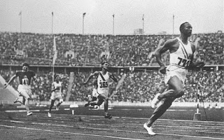
In a technology driven society, professionals who create digital media are increasingly encouraged to be multi modal. Multi-modality refers to using multiple different ways to communicate something (Ball, Sheppard, Arola, 2018). An example of multi modality would be using words to describe the 100m dash at the 1936 summer Olympics as well as including a picture of it. The written text is an example of the linguistic and textual mode while the photo exemplifies the visual mode. The use of multi-modality increases the likelihood the message will be conveyed to the target audience. In the effort of being multi modal, it is imperative to adhere to all copyright laws. There is not complete freedom when creating digital media, there are strict guidelines that must be followed. In this first blog post, I will share ways I am multi modal, explain the importance of intellectual property, and list ways to assess credibility of digital media.
jesseowens
Jesse Owens breaking the world record for the 100m dash at the 1936 summer Olympics

There are five modes that are outlined in Writer/Designer A Guide to Making Multimodal Projects (Ball, Sheppard, Arola, 2018):

  • Linguistic mode- Using written language to describe something  
  • Visual mode- Images and other characteristics that readers see
  • Aural mode- Use of sound in communicating a message
  • Spatial mode- Physical arrangement and organization 
  • Gestural mode- Using movement, such as body language, to convey meaning                          

 As a college student and high school science teacher candidate, multi-modality is a huge part of my work. I do it so much that sometimes I don't even realize I'm doing it. I use the five modes of communicating in the following ways:

  • Linguistic: Using written text to describe my research
  • Visual: Pictures, tables, and graphs used as visual evidence to support my claims
  • Aural: Good volume when speaking to a class or use of video demonstrations
  • Spatial: Using organization when creating a presentation for class or for students
  • Gestural: Using hand gestures to emphasis important points 

Coherently merging all 5 modes, or as many modes as possible, increases comprehension of the audience by increasing the number of mediums in which the information can be conveyed (Ball, Sheppard, Arola, 2018).

I find the use of multi-modality to be most important when teaching high school students. Each student has varying academic capabilities, interest levels, learning styles, and attention spans. If the teacher continually expresses content in one mode, most of the students will become uninterested and their education will suffer. Whenever I do lectures or create activities for the students to do, I not only think about how many different ways I can express the information to them, but how many different ways they can express their answer back to me. Giving students that freedom makes them more comfortable and increases their quality of work (Marzano, 2006). My goal is to differentiate to the needs of each individual student, and the use of multi-modality is largely important in me achieving that goal

Being multi-modal is not limited to a professional setting. I find myself being multi-modal in every day life. My roommates and I share information through a variety of mediums. We have face to face conversations, we share memes and videos with each other, and sometimes we can communicate by just looking at each other. I would actually argue that it is much easier to be multi-modal in every day life. Instead of consciously thinking about what mode to use, you just use the one that naturally fits. Recognizing multi-modality in every day life is helpful in creating a bridge to using it professionally.

While creating multi-modal works on digital platforms, one must adhere to intellectual property and copyright laws. These are laws that protect authors and content creators from getting their work stolen (Carrol, 2017). However, one can still use the work of others, they just must give the original creator their credit. If you were to use somebody's direct words, you would put them in quotation marks and create a citation for it in a reference list. If you use somebody's image, you must link where the image came from or give acknowledgements to the creator. However, images get a little trickier because fair use applies. Fair use prevents somebody from taking an image or design in their work even if they attribute the original creator. These images are only under fair use if they are being used for limited or educational/productive purposes.The reoccurring theme here is to give credit where it is due. Blatantly stealing content or claiming it as your own can get one fired from a job, kicked out of school, or even put in jail.

I just mentioned how if you're going to borrow information from somebody else you must cite it. But how do you know if that information is credible? One way to assess the credibility of something is to fact check it. This would mean checking multiple sources about the same piece of information. If all the sources check out with the same information, it can be deemed factual and those websites credible. Any website listed as .gov and most websites that are .org are credible. Credible websites also often have limited to no advertisements, a clear layout, and no flashing lights and gimmicks. People can literally write whatever they want on the internet whether it's factual or not. Developing skills of assessing credibility helps sift through websites and information that should be avoided. Also, using credible sources with good information improves search engine optimization (SEO) of a site. Major search engines such as google reward sites with credible information and sources by putting them farther ahead on the results page, thus increasing the traffic of the site.


References

Ball, C.E., Sheppard J., & Arola, K.L. (2018). Writer/Designer A Guide to Making Multimodal Projects. Boston, MA: Bedford/St. Martin's.

Carrol, B. (2017). Writing and Editing for Digital Media. New York, NY: Routledge.

Marzano, R.J. (2006). Classroom Assessment and Grading That Work. Association for Supervision and Curriculum Development.